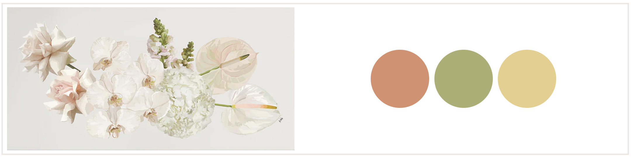
Colour is definitely key to a successful interior! But how do you know the colours you pick will all work? One of the easiest ways to nail it is to take your cue from your favourite piece of art! Here’s some tips on how to do that:
Look beyond the subject of the art
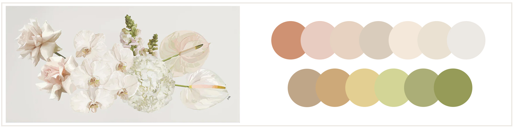
See the breakdown of colours. You might be surprised what you see when you actually focus on the colours rather than the subject!
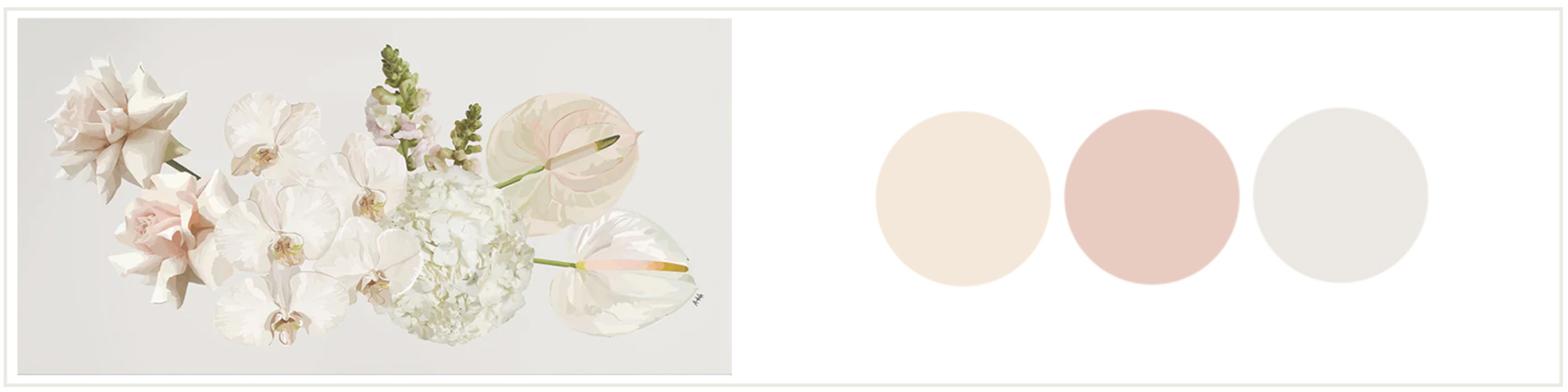
Pick out 2 or 3 colours that best represent the ‘vibe’
Have a think about the feeling you want to create in the room. Do you want it to feel ‘soft and peaceful’ or more ‘vibrant and punchy’? Pick out 2 or 3 shades that you feel best speak to this vibe. This will be your main palette.
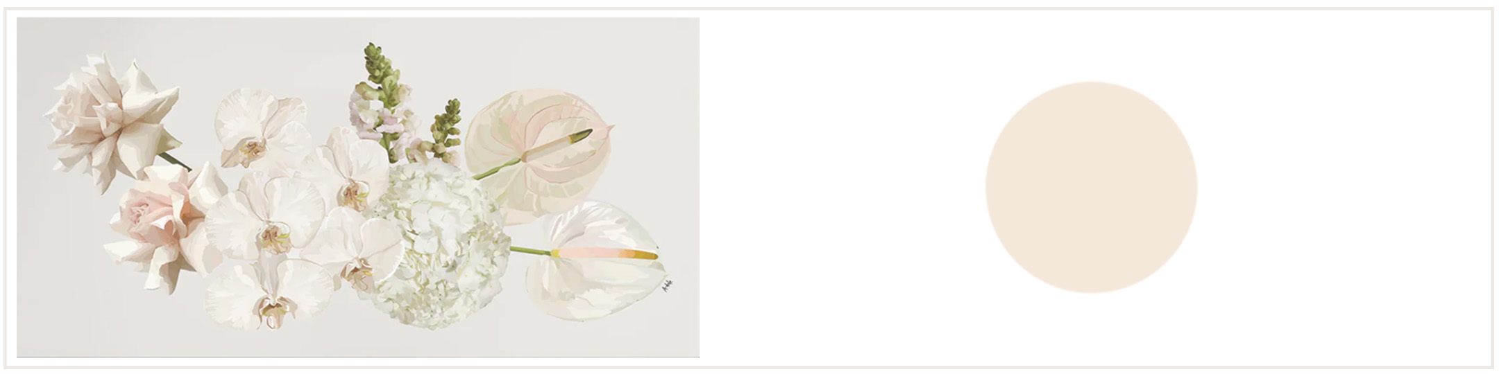
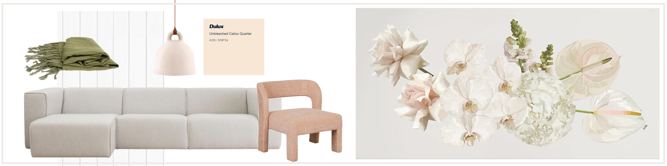
Choose your main base colour
Which of these will be best to use as your base colour? This is the one that will be used in bigger areas or larger pieces like sofas or rugs. Softer or more neutral colours are often a good choice.
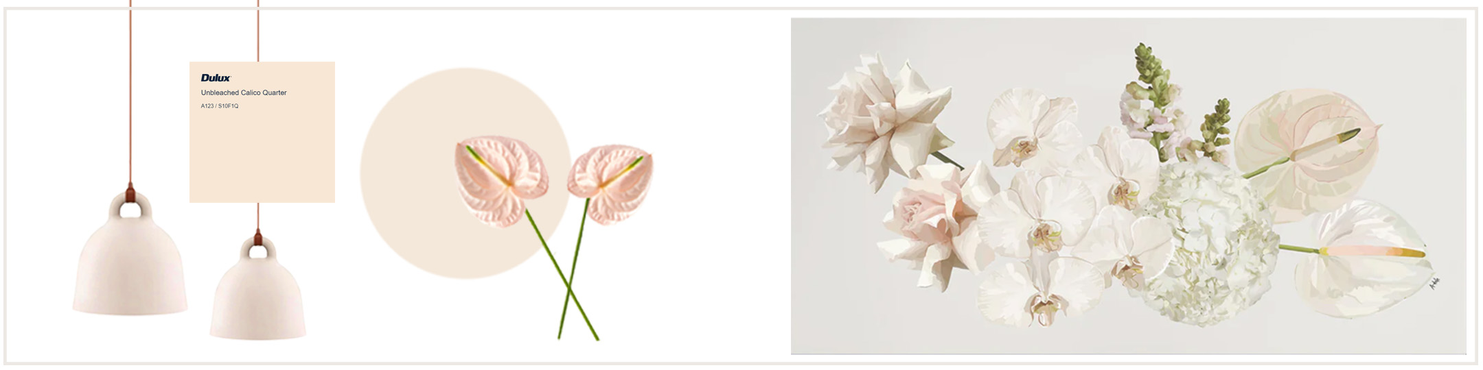
Now pick out a few smaller accent colours
Revisit your artwork and pinpoint what could be the smaller accent colours. These could be used in very small ways, but will often make a big impact.
Use your neutral base for larger blocks of colour
Consider the size of your room and what will go in it. Use your neutral base for larger blocks of colour like big pieces of furniture or wall colours.
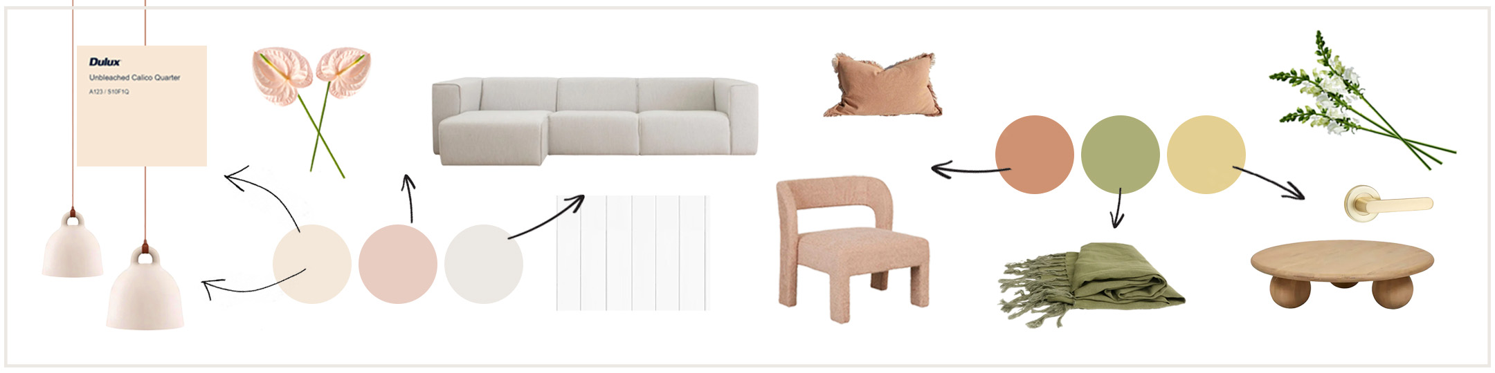
Don’t worry about matching everything perfectly
Don’t get too caught up on finding exact colour matches – just look for things that have a similar undertone and depth. Some variation is a good thing! Like you see in the example below – none of these items is an identical colour match, but they all have orangey pink undertones.
Look for ways to layer in your accent colours
These can often be very small or subtle elements, such as throws or cushions, door handles, picture frames, floral arrangements, vases, books and more. It’s helpful to take your time collecting and curating these accent pieces as you come across them. But having a clear colour palette in mind helps you to spot the perfect piece when you see it!
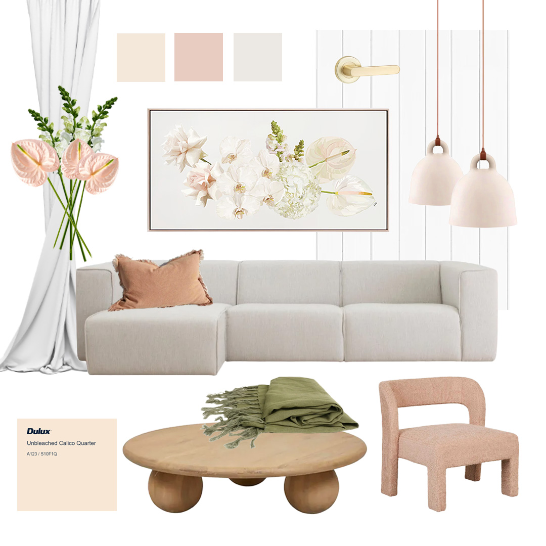
If possible, create a moodboard
Lastly, it’s a great idea to create a visual moodboard before you purchase any big ticket items. This will help you to check that all the colours are working in harmony together and the design is achieving the general feel that you wanted to for this space.